TL;DR
- Manual website audits at our agency averaged six hours per site, roughly eighteen senior hours a month during busy stretches.
- Our audit checklist grew to 214 items across 38 pages by early 2025, and nobody ever ran all of them.
- A client’s contact form failed silently for about three weeks after a plugin update; our audit five weeks earlier had only tested the happy path.
- Audaitly crawls sites in a real browser and verifies every finding against screenshots, the DOM, and measurements; its first run on our own site returned 63 findings.
For six years, manual website audits were how we closed out every project at our agency. Launch on Thursday? The audit happened Tuesday, usually Tuesday night, usually wrapping up around 11pm. One of us would sit down with the staging link, a 38-page checklist doc we’d been growing since 2019, and a coffee that went cold by page four, and click through every screen the way a suspicious customer would. Six hours per site was the average. Eight if the site had a blog.
We’re Solution Bowl, a digital agency of about fifteen people. Audaitly, the website audit tool for agencies we eventually built, exists because those six hours broke us in a very specific, very boring way. Not one dramatic failure. A slow accumulation of Tuesday nights.
Here’s the uncomfortable part: we were good at audits. Clients paid for them, renewed because of them, referred us on the strength of them. The audit was probably our best product. It was also the one everybody on the team quietly tried to hand off to somebody else.
The 38-page checklist nobody actually ran
Our checklist started as one page in 2019. Every mistake we ever made became a line item. A client’s cookie banner covered the mobile CTA for two weeks before anyone noticed, so “check banner overlap at 375px” went in. A thank-you page kept its noindex tag for a month after launch. Line item. A testimonial went out with the name of the client’s competitor in it (copy-paste accident, don’t ask). Line item. By early 2025 the doc had 214 items across 38 pages.
Nobody ran all 214. Nobody could. You’d do the fifty you remembered mattering, skim the rest, and trust your eyes for everything else. The checklist had become a museum of past failures rather than a tool, and the audits themselves drifted toward whatever the reviewer personally cared about. Our designer caught spacing crimes and missed slow endpoints. Our developer caught the slow endpoints and walked straight past a hero headline that said nothing at all.
Do the math with us. Six hours per audit, roughly three audits a month in a busy stretch, all senior time. Call it eighteen hours. That’s more than two full working days every month spent confirming that buttons do what buttons should do. For a fifteen-person agency that cost is not abstract. It’s a feature that didn’t get built and a proposal that went out late.
Somewhere around the fortieth audit doc, I caught myself copy-pasting a contrast finding from an old report and just swapping the client name and the hex values. That was the actual founding moment of Audaitly. Not a vision. A copy-paste.
The Monday call we still think about
The worst one deserves its own section. A retainer client, a services business that lived and died on inbound leads, called on a Monday morning. A customer had emailed them to say the contact form wasn’t working. It hadn’t been working for roughly three weeks. A plugin update had broken the endpoint, the form posted into a 500, and the page responded by showing a spinner forever. No error message. No fallback. Every lead in that window simply evaporated.
We had audited that site five weeks earlier. The form was on the checklist, and we had checked it. But “check the form” meant loading the page, typing test data, watching the fields behave. Happy path. We never submitted and waited for a real response, and we never tried again after the plugin update, because the audit was done and filed. What made it worse: on the kickoff call the client had asked whether they needed a maintenance plan, and we’d said the site was in good shape. It was. That day.
The call was short and bad. We refunded part of the retainer, which was fair. But the lesson wasn’t “try harder”, because we were already trying hard. The lesson was that some checks only count if they actually exercise the thing and run again after every change. Humans do neither for long.
Why weren’t existing audit tools enough?
Existing audit tools read a website as markup, not as an experience. Crawlers, browser extensions, and all-in-one SEO platforms each catch the mechanical layer, broken links, missing alt text, slow scores, and stay silent on the subtle problems that erode a visitor’s trust: dead trust badges, inconsistent CTAs, copy that says nothing.
We didn’t jump straight to building. We spent about a year and a half throwing existing tools at the problem, and some of them earned their keep.
A well-known crawler handled the mechanical layer: broken links, redirect chains, metadata, duplicate titles. Genuinely useful. Still is. But it read the site as documents, not as an experience. It would flag a missing meta description on a logged-out error page and say nothing about a pricing table where the middle plan, the one the client actually wanted to sell, was visually indistinguishable from the plans beside it.
Two browser extensions covered contrast and heading structure, one page at a time. Fine on a five-page brochure site. On a sixty-page site that’s sixty manual runs, and by run nineteen you’re clicking through without really looking. The usual performance scorers gave us numbers, and numbers are honest, but a score of 61 doesn’t tell a client which 2.4 MB hero image to resize or whether anyone actually feels the delay.
We even tried the all-in-one route for a quarter, one of those platforms that does rank tracking and backlinks and site health in a single dashboard. It was built for SEO teams, fair enough, and it showed. Everything about the lived experience of using the site, the part our clients pay us to care about, sat outside its universe entirely.
Every tool shared the same blind spot. Loud about the obvious, silent about the subtle. Missing alt text got flagged instantly. But a trust badge that links to nothing, a testimonial with a broken quotation mark, “Get Started” on one page and “Get started” on four others, a CTA that looks clickable and isn’t? Silence. And the subtle stuff is precisely what erodes a visitor’s trust, because visitors feel it even when they can’t name it.
There was a second, sneakier problem. The tools didn’t reduce the work; they relocated it. Point three scanners at a site and you get 400 warnings, of which maybe a dozen matter, and now somebody senior has to spend the afternoon deciding which dozen. We had swapped six hours of clicking for five hours of triage plus an hour of clicking. The spreadsheet where we merged scanner output had a column literally titled “do we care?”. When your process has a “do we care?” column, the process is telling you something.
What should a website audit tool actually do?
A useful audit tool has to review every page the way a senior human reviewer would: measure the deterministic things exactly, exercise forms including their failure states, read the copy for tone and casing drift, and attach evidence to every claim so no finding is ever just an opinion.
Somewhere in 2025 we wrote down what a tool would have to do for us to stop doing Tuesday nights. The list was short and slightly unreasonable.
It would read every page the way our most senior reviewer reads a page, not the way a parser reads markup. It would check the deterministic things exactly: contrast ratios, image weights, heading order, response codes. It would exercise forms for real, including the failure states, because of that Monday call. It would notice copy: tone drift, casing drift, claims with nothing behind them. And it would never make an assertion without attaching proof, because an audit finding without evidence is just an opinion wearing a severity label.
We argued about scope for weeks. One camp wanted a scoring tool, a single number to put at the top of reports. The other camp, the one that won, wanted findings. Scores make you feel something; findings make you fix something. A client can’t act on a 74.
There was one more requirement, less glamorous. Whatever we built had to explain itself, because agencies forward these reports to clients, and a finding that reads like machine output undermines the agency sending it. The reports had to read like a careful, slightly opinionated person wrote them. That’s whose job they’re doing.
No tool did all of that. Believe us, we looked.
So we built Audaitly
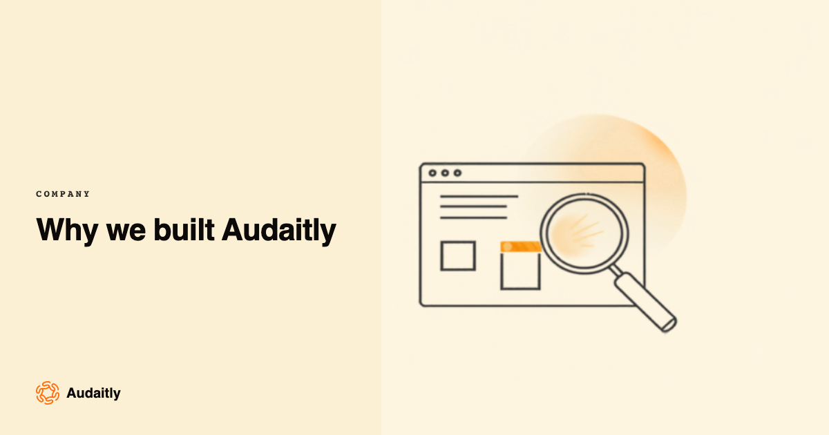
Audaitly crawls a site in a real browser, the same way a visitor arrives. It renders every page, takes screenshots, reads the DOM, measures what can be measured, and fills in the forms. Then a frontier model reviews each page across UI and UX, content, conversion, SEO, performance, accessibility, forms, and compliance signals, and every finding is verified against the evidence before it’s allowed anywhere near the report. What comes out is prioritised page by page, criticals first, in plain English, and it turns into assignable page-wise tasks instead of a PDF that gets skimmed once and archived.
We got plenty wrong on the way. The first version worked from fetched HTML instead of a rendered page, which kept it blind to anything client-side, which in 2026 is most things. Scrapped. The second version trusted the model’s findings without verification, and it confidently reported an accessibility issue on an element that didn’t exist. That embarrassment is how the evidence pipeline became non-negotiable: every finding now has to survive a check against the screenshot, the DOM, and the measurements. The model proposes. The evidence disposes.
The first full run on our own agency site returned 63 findings. Our own site. The one we had hand-audited twice. Among them: a footer link to a service we shut down in 2023, and a mobile menu that trapped keyboard focus. We shipped fixes for a week straight and felt roughly equal parts vindicated and embarrassed.
Then our intern, three weeks into the job, pointed an early build at a prospect’s site and it flagged a hero CTA that scrolled to a section that no longer existed. Three senior people had reviewed that page by hand days earlier. Nobody had clicked the button. That one ended the internal debate about whether this was worth building.
To be clear about what it doesn’t do: Audaitly won’t have the strategy conversation for you. It can tell you the hero says nothing and prove the form eats submissions; it can’t decide whether the client should reposition around a new service line. That part is still your job, and honestly, that’s the part of agency work worth keeping. We built the tool to protect that part, not replace it.
Where things stand
Audaitly is open to an invite-only founding cohort right now, mostly agencies shaped like ours, because agencies are who we built it for and who we understand. If you audit other people’s websites for a living, you already know the Tuesday-night feeling. You can see what it costs, or request an invite if you’d like in.
And no, we haven’t stopped doing a human pass before big launches. Old habits. But it’s one hour now instead of six, and that hour goes to judgment calls: positioning, tone, the argument about whether the hero actually says anything. Not clicking every footer link at 11pm. If you’re curious how we think about the craft itself, we wrote up what a good audit looks like.
The anatomy of an audit that actually finds things
How to audit a website so it actually finds things: evidence for every claim, the small stuff that erodes trust, and a checklist honed over 200 hand audits.
EngineeringHow we isolate every agency's data with Row-Level Security
Multi-tenant SaaS data isolation with database Row-Level Security: why WHERE clauses fail, how we fail closed, and the near-misses that shaped the design.
See it on your own sites.
Audaitly is invite-only while we onboard our first cohort of agencies.